
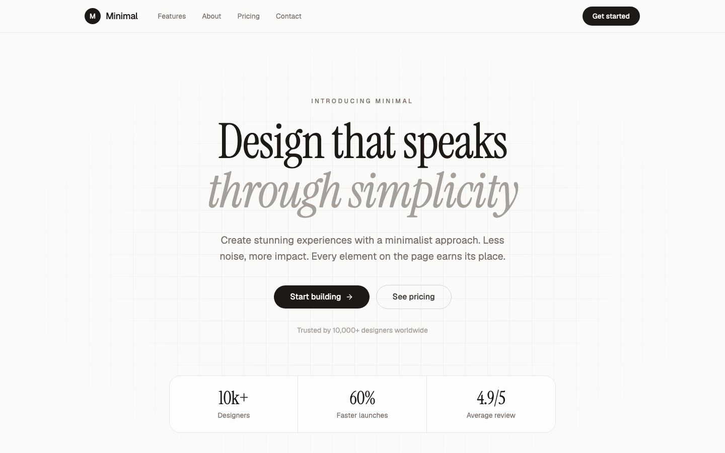
How to make a landing page that works comes down to one goal and a fixed order. Pick the goal, write a headline that names the visitor's problem and your result, then answer their doubts in a fixed order (how it works, proof, price, FAQ) and repeat a single button until the page ends. Colours and tools matter much less than that. The quickest way to build one in VibeDream is the Aesthetic Landing Page template, covered step by step below.
Landing page vs website
A website is a set of pages for people who arrive with different questions. A landing page is one page for people who arrive with one question, usually from an ad, an email or a post about one offer. That difference changes the design.
- A website has a full menu. A landing page usually hides it or keeps it to a logo and one button, so visitors are not pulled away.
- A website serves many goals. A landing page serves one, such as booking a call.
- A website is judged over many visits. A landing page is judged by one number, the share of visitors who take the action.
- You can have many landing pages, one per offer or audience, all pointing at the same business.
If you need several pages that people browse, read how to build a website instead. If you have one offer and traffic you are about to send somewhere, keep reading.
The seven sections that do the work
Good landing pages differ in style but follow a similar order, because it matches the order of a visitor's doubts. You can drop sections for a simple offer, but keep the order.
- Hero: a headline, one supporting sentence, the main button and an image of the actual product or result. This is where most visitors decide to stay or leave.
- The problem: two or three lines that show you understand the situation the visitor is in.
- How it works: three short steps. People trust what they can picture.
- Benefits with detail: what they get, in concrete terms. Saves you two hours a week beats powerful.
- Proof: real testimonials with names, logos you have permission to show, numbers you can back up, or screenshots. Leave it out rather than invent it.
- Price or offer: what it costs and what is included. Hiding the price usually costs more trust than it saves.
- FAQ and final call to action: answer the four or five objections you hear most, then the same button again.
Copy that holds up
Most weak landing page copy is about the seller. Write about the reader. A useful test: could a competitor paste your headline onto their page unchanged? If yes, it is too generic.
- Outcome plus timeframe: Get your first ten clients in 30 days without cold calls. Only use a timeframe you can stand behind.
- Problem then answer: Tired of chasing invoices? Send one link and get paid.
- For who, to do what: Bookkeeping for freelance designers, done in ten minutes a month.
- Button text should say what happens next: Book a call, Get the checklist, Join the waitlist. Avoid Submit.
- Write short paragraphs of one to three sentences. Most visitors scan on a phone.
One call to action, repeated
A landing page with three different buttons, say Book a demo, Download the guide and Follow us, splits attention and usually converts worse than a page with one. Choose the single action that matters most and repeat that same button after the hero, after the benefits and at the end. If you must offer a softer option, such as a newsletter for people not ready to buy, put it once, near the bottom, as a text link rather than a second big button.
Speed and phones
Much of the traffic from ads and social posts arrives on phones, and phone visitors leave slow pages quickly. Keep the hero image compressed, avoid autoplay video above the fold, and check the page on a real phone on mobile data rather than a desktop browser shrunk down. Make sure the main button is visible without scrolling on a small screen and big enough to tap with a thumb.
Build one with AI from a template
The quickest route in VibeDream is the Aesthetic Landing Page template, pictured above. It comes with an editorial hero, features, testimonials, pricing, about and contact pages, plus privacy and terms pages, and it is built to look right on phones. All of its copy lives in one content file, so edits by prompt land cleanly.
- Tap New Project, then Use Template, and pick Aesthetic Landing Page.
- Give it the facts in one message: product name, who it is for, the one action, the price, and three benefits.
- Ask it to rewrite the hero for your offer and change the accent colour to match your brand.
- Replace or remove the sample testimonials. Do not publish placeholder reviews as if they were real.
- Ask for the menu to be reduced to your logo and the main button, so the page has one path.
- Check phone view, then press Put it online. Publishing costs 5 credits and gives you a vibedreams.ai address with HTTPS.
If your goal is to collect emails before launch, start from the Aesthetic Waitlist template instead. It saves signups for you and shows a live count, with no setup. For an event with a date and an RSVP, see how to build an event landing page.
Other tools worth knowing
For a very simple one-page site, Carrd is a popular low-cost option. Its Pro Lite plan is $9 a year and Pro Standard, which adds custom domains and forms, is $19 a year. Checked: Oct 2026 on carrd.com/pro. Site builders like Wix and Squarespace also have landing page templates on their monthly plans. VibeDream makes more sense when the page needs to do something custom, such as save signups to your own backend, or grow into an app later, and when you want the code.
Checklist before you send traffic
- The headline makes sense to someone who has never heard of you.
- The main button says what happens next, and it works on a phone.
- There is exactly one primary action on the page.
- Every testimonial, number and logo is real and you have permission to use it.
- The page loads quickly on mobile data. Test it on your own phone away from wifi.
- The form saves submissions, and you have seen a test submission arrive.
- There is a privacy policy link under any form that collects personal data.
- The page has a clear title and description for when it is shared in messages and search results.
Measure it and improve it
- Decide the one number that matters, such as signups divided by visitors, before you send any traffic.
- Add an analytics tool. You can store its key in project settings; the API keys guide shows where, and which keys are safe in the browser.
- Wait for a few hundred visitors before judging. Small samples swing wildly.
- Change one thing at a time, starting with the headline, then the offer, then the proof.
- Read every reply and question you get. The objections people raise belong in your FAQ.